
Map Key
Through utilizing a species distribution modeling approach we are able to map out current areas that have a suitable climate habitat for each species that we examine.
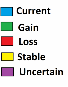
Here is a legend that is provided for each species. It corresponds to the colored layers that are in the Google Map itself:
The following MAP KEY will help you further understand how to navigate each map’s fun colored layers for each species.
You may be asking what these colors mean. What might the mysterious words, “Current,” “Gain,” "Loss,” “Stable," and "Uncertain” mean in these maps?
What does it imply about the endangered species we are examining?
If you are especially curious you’ll also be wondering how we decided that these highlighted regions were determined. How did we decide that area near the 405 freeway should be highlighted in blue and correspond to “current” rather than to “loss?”
These are all valid questions that we hope you are all thinking about so let us tell you what they mean and how we came to designate these areas:
1. WHAT THE COLORS AND WORDS STAND FOR:
Current- areas of suitable habitat for the particular species based on the current climate and current land use of the area
Gain- areas that will be suitable habitat gained (compared to Current) by the year 2100. assuming the best-case scenario (unlimited dispersal of the species). It is based on the predicted climate and predicted land use of that area of the year 2100
Loss- areas that will be suitable habitat lost (compared to Current) by the year 2100, assuming the worst-case scenario (no dispersal of the species). It is based on the predicted climate and predicted land use of that area of the year 2100
Stable - areas that will continue to be suitable habitat lost (compared to Current) by the year 2100, due to climatically-stable suitable habitat.
Uncertain-areas in which are are not statistically significant enough on one side to determine whether it will be suitable or unsuitable habitat based on the predicted climate and land use by 2100
2. HOW WE DESIGNATED THE AREAS:
The areas were actually calculated by a modeling algorithm system called MAXENT (version 3.3.3a). This algorithm system is able to model the current and future species-climate relationship based on current climate data as well as predicted climate data for these areas in the year 2100. MAXTENT integrates climate data with information about the particular species in question (i.e. what kind of climate does it thrive in, dispersal scenarios) and then visualizes the model predictions on ARCMAP 10.0, a mapping software.
Basically
current or future climate data + info about particular species = highlighted areas visualized on a map
Note that info about particular species includes what kind of climate it might thrive in so that MAXENT can calculate suitable habit areas. It also includes dispersal scenarios that are equally important calculate where there will be gain or loss.
The GAIN scenario implies that we imagine the unlimited dispersal of plants everywhere, so that the highlighted green GAIN area is where these plants will actually grow if we dispersed them everywhere in Southern California. The LOSS implies a scenario in which there is no dispersal. These areas will no longer be suitable habitat for the plants in these areas assuming the plants are also not dispersed in that area.
